VISUALISING SDG 11.7 WITH INFOGR8 [MAR 2024]
WORKSHOP • FUTURE FRIDAYS / HOST • INFOGR8 IN PARTNERSHIP WITH DVS / STYLE • STATIC DATA VISUALISATION
_
A data story, comprised of two static data visualisations, that explores open public space and how its availability differs from city to city.
In March 2024, Data Storytelling company infogr8 partnered with the DVS to host a month-long Future Friday event, centred around the UN’s Sustainable Development Goals (SDG). The infogr8 team led four 2-hour collaborative sessions, in which they explored how creative data visualisations are conceptualised and developed. This month’s luminary, Alice Thudt, also walked participants through the SDG landscape, highlighting the various intricacies, pitfalls and interconnectedness of each of the indicators.
THE TASK
_
The social impact challenge set this month involved honing in on a topic found within the UN’s SDG Indicator Database that could be visualised as part of a compelling data story. The decision was made to select SDG 11.7, a goal focusing on making cities sustainable, by improving the availability and accessibility of open public space. Using data supplied by UN-Habitat, the visualisation explores the relationship between a city or country’s open public space percentage and their respective economic classification according to the World Bank.
Initially, this data was built into a beeswarm plot, which seemed the most appropriate chart to use due to the volume of data points (e.g. 904 cities) included in the analysis. The graphs similarity to a one-dimensional scatterplot also meant that over-arching trends between the different economic classification groups were easily visible. Further trends were also made apparent by introducing colour as an additional encoding metric to represent a city’s region.
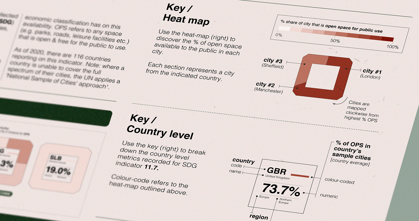
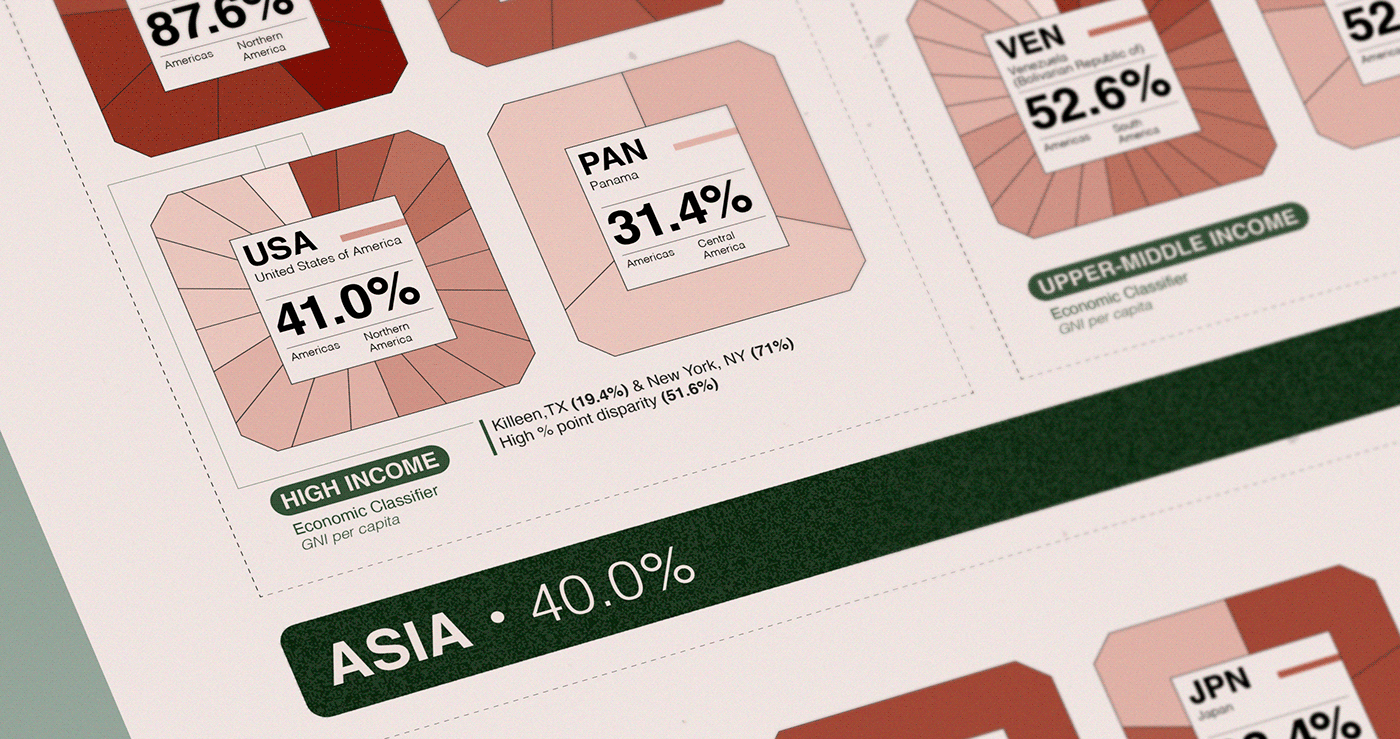
After using the swarm plot to highlight the underlying trend, it also felt necessary to produce supplementary information on SDG 11.7 at a country level. For this reason, a poster was designed to showcase the individual make-up of a country’s urban landscape. This was achieved via the implementation of a heat map that uses a stepped colour gradient to illustrate the % of open public space available to a city.
INSPIRATION
_
When displaying the impact of urban development, the immediate thought was to represent the data in a gridded system akin to the iconic, repeating octagonal motif designed by urban planner Ildefons Cerda for Barcelona in 19th century.
This visual metaphor was chosen for the project to highlight the difficulties countries face when providing their citizens with accessible open space. Here, open space does not just mean “green space”: it also encompasses roads, public transit systems and other public facilities such as leisure centres.
In addition, Swiss Design - popularised in the 1950’s - was often used by designers in urban settings, where the dissemination of information, notably on road signs or within public transport systems, is key. This made it a fitting choice to employ in a project which explores the urbanisation of cities.